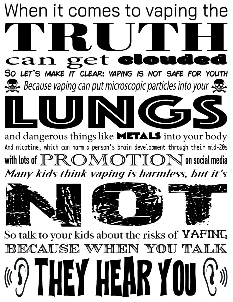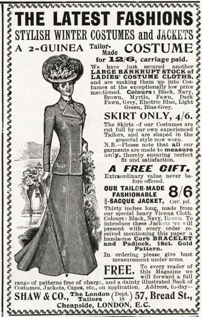
This was a poster I made when studying ads made in the Victorian Era in an attempt to replicate it for a homework assignment. While this may look displeasing to look at now, this is how most ads looked back in the day. This form of ad is also one of the earliest examples of type hierarchy being effectively used. This means that the big and bold words are what your eyes are drawn to first when you first look at a body of text, and then you’re eyes follow down the page by the weight of the words/sentences. Since the number of fonts that exist now are much bigger and more unique then they were in the 1800’s, I was able to give the key words more of a personalized feel to them. Overall, I really enjoyed this assignment.
Because of how much more expensive it was to print things in this era, people were a lot more “bold” with how they arranged their typography. No space was wasted on the pages as they came hot off the press, as they made sure to fit in as much information as possible by any means necessary–stretching the type to get the key points across, and using a plethora of fonts to catch your attention. Nowadays, graphic designers are locked into two fonts per document (three if you’re feeling wacky), which is probably for the good of humanity. I personally think it limits what you can express with typography, but that’s a story for another day.

